
This project was a full website redesign that would reflect the quality and depth of Joseane’s work, not only to increase trust and connection with potential clients, but also to position her services at their true value.
The site needed to feel welcoming, calm, and human, and connect more deeply with potential clients while clearly communicating her expertise and unique approach to therapy.
I led the entire UX and UI process, from research and strategy to wireframes, visual design, and responsive prototyping. I’m also responsible for developing and publishing the final website.
Throughout the project, I worked closely with the client to align the design with her professional goals and ensure the tone, structure, and content reflected her expertise.

Joseane’s previous online presence didn’t reflect the depth or value of her work. It failed to effectively communicate her eight years of clinical experience and international practice.
The website lacked structure, visual hierarchy, and a cohesive identity, making it difficult for potential clients to understand her approach, trust her expertise, or feel emotionally connected. Visually, it also didn’t convey the balance of professionalism and warmth that psychological care requires.

This solo project includes end-to-end design and front-end development for a fully responsive website. The scope covers research, content strategy, visual design, and implementation.
Although the primary goal is aligned with the psychologist’s business objectives, all design decisions are made with a user-centered approach in mind, and iterations are based on both client collaboration and user insights.

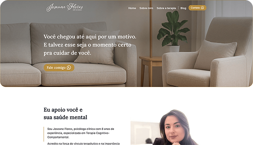
Joseane came to me with a website that no longer represented the quality or depth of her work. The visual identity was outdated, and the site’s structure didn’t support the kind of welcoming, calm, and professional experience she offers in therapy.
Potential clients often arrive on a psychologist’s website in moments of emotional vulnerability. But the old site lacked clarity, hierarchy, and emotional warmth, making it harder for people to understand who Joseane is, how she works, and why they could trust her.
In our initial conversations, it also became clear that:
From a UX perspective, the challenge was to:
This project is guided by both the psychologist’s business goals and the needs of her potential clients. The objective is to align design and content in a way that supports both.
Reposition the therapist’s digital presence to reflect her experience, professionalism, and the value of her services.
Support a premium positioning by clearly communicating the quality of care and justifying future pricing adjustments.
Provide a flexible platform to publish relevant content, such as articles and texts, reinforcing her authority and online presence.
Build a clear, informative, and easy-to-navigate website that inspires trust, helps users quickly understand who the psychologist is and how she can help, and guides visitors through key content.
Create a welcoming and emotionally supportive experience that helps potential clients feel safe and understood.
Ensure the website is responsive, accessible, and easy to maintain over time.

To design a website that truly reflected Joseane’s work and connected meaningfully with potential clients, I began the project with a strong focus on user research.
My objective was to uncover how potential clients interact with therapy websites: what they expect, what makes them feel safe, how they wanted to feel during that experience, especially in moments of emotional vulnerability, and what might push them away, while also understanding what Joseane wanted her website to communicate about her work and value.
This phase laid the foundation for every design decision that followed.
Understand the target audience's specific needs, pain points, and goals (e.g., anxiety, depression, relationships, self-esteem).
Gather insights into user expectations for a psychologist’s website (e.g., what they expect from the design, what information they need, how they want to feel).
Identify the key factors that build trust and authority in a psychologist’s online presence.
Understand how to make users feel welcomed, safe, and comfortable while visiting the website.
Validate design ideas and content with Joseane and users before finalising decisions.
These goals were essential to guide decisions not only in the visual design, but also in content prioritisation and tone of voice.
In order to gather meaningful insights, I used a combination of quantitative and qualitative methods:
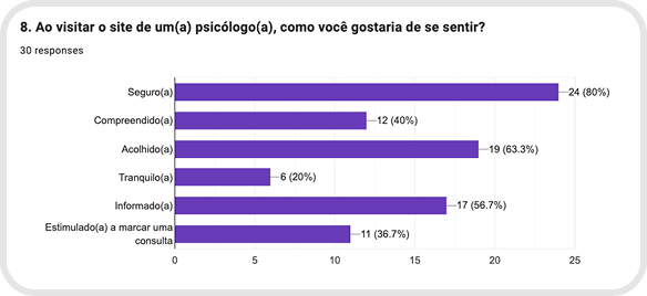
Navigation and Structure
Emotional Connection
Content and Tone of Voice
Decision to Reach Out
Perception of Value
Elements That Reinforce Trust
(from the client’s perspective)
Reposition the therapist’s digital presence to reflect her clinical experience, professionalism, and the value of her services
Support a premium positioning by clearly communicating the quality of care and justifying future pricing adjustments
Provide a flexible platform to publish relevant content, such as articles and texts, reinforcing her authority and online presence.
(from interviews and survey)
Build a clear, informative, and easy-to-navigate website that inspires trust, helps users quickly understand who the psychologist is and how she can help, and guides visitors through key content
Create a welcoming and emotionally supportive experience that helps potential clients feel safe and understood
Ensure the website is responsive, accessible, and easy to maintain over time
This project had a clear strategic challenge:
At the same time, the site also needed to meet the emotional needs of people seeking therapy, many of whom visit these websites during difficult or delicate life moments.
The solution would need to:
This alignment between business goals and user goals was the foundation for all design decisions moving forward.

After collecting and analysing both qualitative and quantitative data, I moved into the Define phase. My goal here was to translate everything I had learned - from emotional needs to technical expectations - into strategic tools that would guide the design decisions ahead.
This phase involved building empathy maps, crafting personas, identifying core user needs, and defining the key problems the website needed to solve.

“I need help, but I don’t want to feel judged or weak because of it.”
Mariana is a 32-year-old marketing coordinator with a postgraduate degree, living in a medium-sized city. Although she appears to have her life in order, she feels emotionally overwhelmed due to work pressure and unresolved family issues. She has been struggling with anxiety for years but avoids showing vulnerability trying to stay strong for everyone.
Recently, her emotional load has become too heavy to carry alone. She’s now looking for a therapist who can help her understand the root of her anxiety and guide her toward emotional clarity and balance.
When searching for a professional, she turns to Google and Instagram. What she values most in a therapist’s website is language that makes her feel seen and understood right away, clear explanations about how therapy works, and a sense that the professional is confident, warm, and trustworthy.

To understand why she feels anxious even when everything seems "fine"
To deal with emotional overload from work and personal relationships
To regain emotional balance and strengthen her self-worth
To have a safe space where she can talk without feeling judged
To take care of her mental health before things spiral

Fear of opening up and not being understood
Doubts about whether therapy will actually work for her
Insecurity about the financial investment
Mental exhaustion that makes even asking for help hard
Feeling like she has to “handle everything alone” all the time
Fear of websites that sound too generic or too technical

32 years old, female, educated, lives in a medium or large city
Digitally active: uses social media to look for professionals and consumes mental health content
Values aesthetics and organisation, but needs emotional connection to take action
Needs to feel understood before she can trust someone
Emotionally exhausted, but still trying to appear strong


Feels emotionally overwhelmed and starts considering therapy
Talks briefly with friends or searches for emotional health content on Instagram
“I can’t keep doing this alone.”
“Maybe I should try therapy… but where do I start?”
Tired, anxious, but hesitant and unsure
Vulnerable, but afraid of being seen as weak
Fear of being judged or not taken seriously
Lack of energy to research too much
Use emotionally resonant content on the homepage to validate her feelings
Use soft, calm language that invites without pressure
Offer a warm introduction to therapy without sounding “clinical”
Searches on Google or Instagram: “psychologist for anxiety”, “therapy for women”
Clicks on a few websites, scrolls briefly
Looks for someone who “feels right”
“Do I trust this person?”
“Does she understand women like me?”
Unsure, self-conscious, emotionally cautious
Alert to tone: she’ll leave if it feels too distant or generic
Cold or overly formal language
Visual clutter or unclear structure
Lack of information about how therapy works
Ensure first impressions feel human and emotionally safe
Include a short and warm welcome message
Present a clear, structured overview of services and approach
Reads about the therapist’s approach
Looks for what the sessions are like and who the psychologist helps
Checks for scheduling options and contact info
“Can I see myself here?”
“Is she someone I could trust?”
A bit more hopeful, but still unsure
Curious, cautious, and in need of reassurance
Jargon, over-explaining, or generic phrases
Unclear service descriptions
Uncertainty about pricing or process
Use plain language to describe the therapy process
Be transparent about what to expect (even emotionally)
Include supportive phrases like: “You don’t need to have all the answers to get started.”
Add patient-friendly FAQs
Clicks on WhatsApp or fills out a contact form
May take a day or two to actually send the message
“What should I say?”
“What if she doesn’t respond?”
Nervous, exposed, but willing to try
Relieved for taking a step
Fear of not receiving a reply
Anxiety about how to phrase the first message
Fear of being misunderstood
Include guidance on what to expect after contact
Use a calming CTA (“Let’s talk”, “Send a message, no pressure”)
Add availability or typical response time
Keep form minimal and mobile-friendly
Sends a message or books a first session
Waits for response or confirmation
“I hope I made the right choice.”
“I’m doing something for myself.”
Nervous but proud
Starting to feel more hopeful
Lack of follow-up, delayed response
Overwhelming onboarding or unclear next steps
Personalise the response process
Keep tone welcoming and supportive
Reinforce that seeking help is an act of strength
Rafael is a 44-year-old financial analyst living in a large city. He’s currently going through a marital crisis and struggling with low self-esteem, especially in his personal relationships. Although he has never done therapy before, he recently started considering it after a friend’s recommendation.
He finds it difficult to express his emotions and often carries the weight of his struggles in silence. What he’s looking for is someone who can help him understand his emotional patterns and support him in building healthier relationships, starting with himself.
Rafael searched for therapists on Google using terms like “psychologist for relationships” and visited a few websites. To feel comfortable, he needs a site that conveys professionalism and seriousness, explains clearly how therapy works, and reassures him that therapy is also for people like him, not just for extreme cases. He’s looking for clear, structured information and avoids overly emotional or vague content.

“I want to get better, but I’m not sure I can talk about all this with someone who doesn’t know me.”
Understand his emotional patterns and his role in recurring relationship conflicts
Improve his communication and regain self-confidence
Build healthier relationships, starting with himself
Get support without feeling judged or exposed
Take control of his emotional well-being before it impacts more areas of his life
Embarrassment about needing help or starting therapy for the first time
Fear of being misunderstood or not knowing how to express himself
Insecurity about opening up to someone he doesn’t know
Discomfort with emotional or overly vague language
Internalised belief that “he should handle things on his own”
44 years old, male, college-educated, lives in a large urban center
Not very active on social media; prefers practical, direct communication
Logical, observant, emotionally closed off but self-aware
Struggles to ask for help but values clear structure and professionalism
Needs a calm, respectful environment that doesn’t pressure or overwhelm


Feels disconnected in his marriage, low self-esteem.
After talking to a friend, he considers therapy for the first time.
“Maybe I should talk to someone… but is therapy really for me?”
“Is it too late to fix this?”
Lost, doubtful, slightly ashamed
Internalised stigma around asking for help
Fear of being vulnerable
Normalise therapy with subtle, reassuring language
Avoid emotional exaggeration
Present therapy as a logical, adult choice
Googles phrases like “therapy for relationship problems”
Opens a few websites, skims for clarity
“Does this person seem professional?”
“Will I be taken seriously?”
Skeptical, emotionally closed off, observing
Sites that feel too emotional or vague
Lack of concrete information on services or therapist background
Clean, professional layout
Clear explanations of how therapy works
Include a section for first-timers or men starting therapy
Looks for structure, pricing, approach, and credentials
Skips emotionally dense paragraphs
“Can I trust this person?”
“Is this someone who will judge me?”
Reserved, hesitant but considering
Looking for professionalism over emotional language
Fluffy language or lack of clarity
Unclear expectations about the process
Use firm but compassionate tone
Keep language simple and grounded
Highlight expertise and structure without sounding cold
Sends a short message or books a session
Waits to see if he feels comfortable continuing
“What am I even supposed to say?”
“Is she going to think I’m broken?”
Hesitant, exposed
Wants support but fears opening up
Anxiety around the unknown
Fear of being misunderstood
Reduce pressure in CTAs (“Reach out when you’re ready”)
Provide brief explanations of what happens after contact
Reassure in tone: “You don’t have to explain everything at once.”
Receives a reply or confirmation
Starts feeling like this might actually help
“I think I made the right choice.”
“Maybe I don’t have to do this alone anymore.”
Still guarded, but hopeful
Relieved to have taken the first step
Vague or overly emotional responses
Lack of follow-up or direction
Use calm, confident tone in first contact
Provide clear next steps
Reinforce that seeking help is strength, not weakness
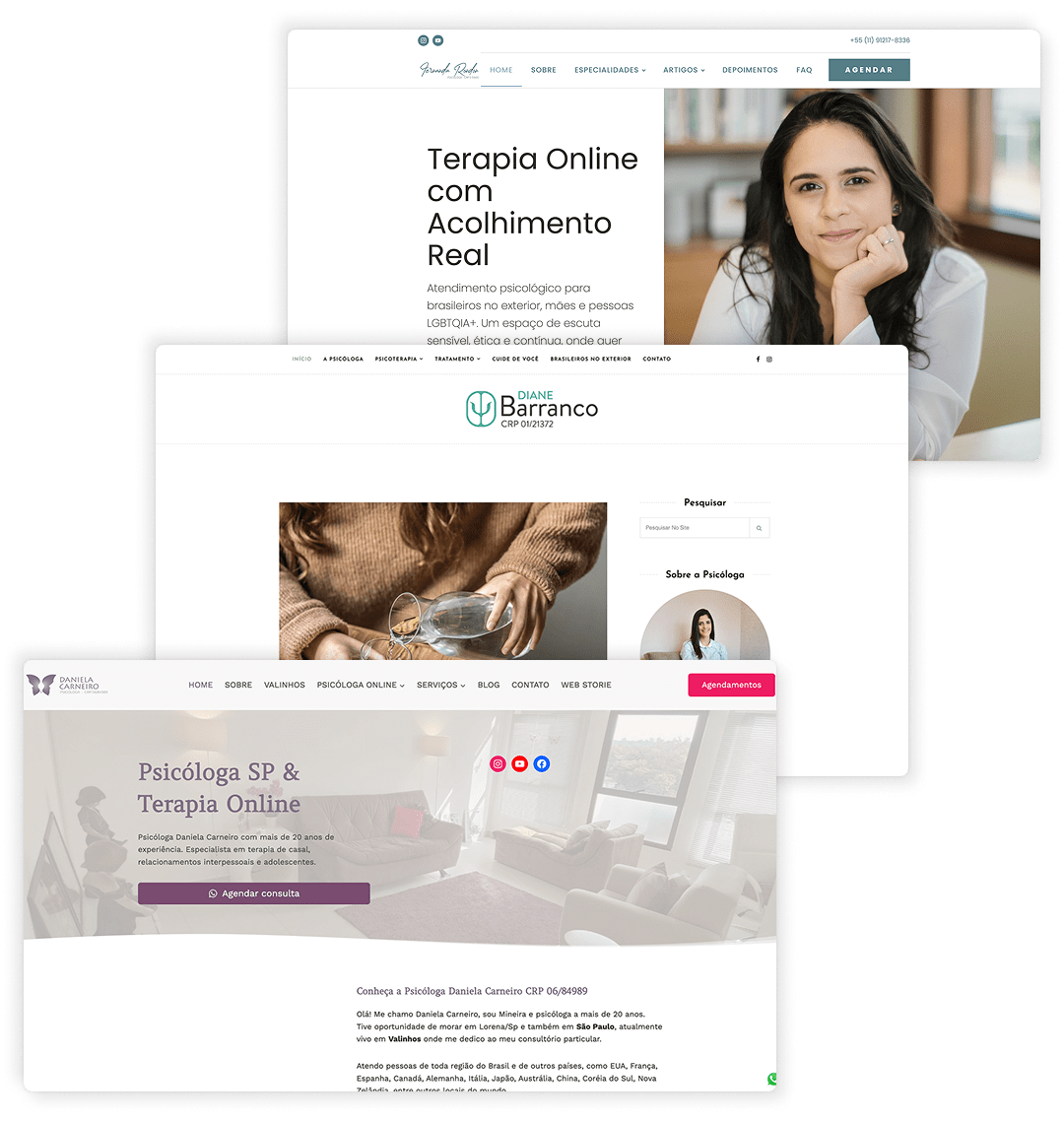
To better understand how therapists are currently positioning themselves online, I conducted a competitive analysis of three professionals in the mental health space, all working in Brazil and offering similar services to Joseane. The goal was to identify patterns, gaps, and opportunities for differentiation.

Clear menu with specialties, blog, testimonials, FAQ.
Organized menu, therapy types and self-care separated.
Detailed menu with location and therapy options.
“Agendar” (schedule) and WhatsApp visible top-level.

Important details like CRP are barely visible.
Key info easy to find, including CRP and services.
Key info easy to find, including CRP and services.

Overall responsive, but some elements appear misaligned.
Functional on mobile with responsive layout.
Responsive with good structure.
Clear description of services.
Clear and comprehensive service descriptions.
Clear service categories and descriptions.
Jungian approach explained.
TCC approach clearly explained.
No mention of therapeutic approach.
Professional tone with subtle emotional engagement.
Balanced, professional tone.
Professional and informative.
Clear, simple Portuguese.
Accessible and natural language.
Direct and accessible language.
Blog is limited, with only one post published in 2025
Blog section updated constantly.
Despite having many blog posts, the content lacks publication dates, making it harder to assess recency.
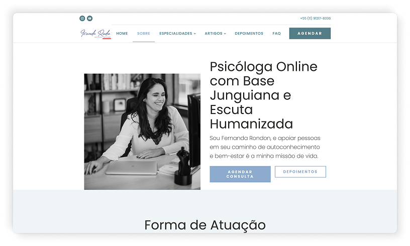
Online psychologist with a Jungian approach and humanised listening.
Very clear TCC approach.
Not clearly positioned.
Expats, mothers, LGBTQIA+ clearly listed.
Clear niche in anxiety, self-esteem, expats.
Focus on anxiety, workplace conflicts, adolescents, and relationship issues.
CRP is present but barely visible.
Features a dedicated page sharing feedback from clients.
Visible CRP, blog constantly updated, feedback from clients.
CRP is clearly visible, and the homepage features a client testimonial linked to a Google review.
Expats and LGBTQIA+ therapy angle.
Offers therapy for expats, ADHD, OCD, and PTSD.
Offers therapy for expats and home care services.
Empathetic and inviting tone.
Welcoming, calm tone.
Neutral and clinical tone.
Content reflects user concerns.
Copy addresses emotional struggles directly.
Professional but lacks emotional validation.
Images reinforce calm and trust.
Warm and welcoming photography.
Emotionally resonant images.
Service process and benefits are explained.
Briefly mentioned.
Clear expectations and process outlined.
Modern and clean design.
Clean and professional identity.
Visually clean, but with minor inconsistencies and a dated feel.
Quality content and structure support premium feel.
Slight premium feel, but could be stronger.
Slight premium feel, but could be stronger.
Duplicate link names leading to different content cause confusion.
Small hamburger menu, but consistent flow.
Good overall experience.
Clear typography, but low contrast in some colour combinations.
Typography is too small, reducing readability.
Good readability, but menu links could benefit from increased size and stronger colour contrast.
Contact buttons are easy to find, but there's no contact form.
There’s no contact form, though contact buttons can be found.
Contact buttons are easy to find, but there's no contact form.
While each competitor had strengths, such as elegant design or reflective writing, none of the websites managed to combine clear service communication with emotional safety and trust-building elements.
Here's what I observed:
Many sites use distant or overly technical language, which makes them harder to connect with emotionally.
The mobile experience shows room for improvement, especially regarding accessibility aspects.
None of them include guidance about the next steps after getting in touch.
Visuals tend to be clean and professional, but emotional connection is often left behind.
These gaps led to clear design opportunities for Joseane’s website:
Communicate her value and professionalism while maintaining a warm, empathetic tone.
Provide plain-language explanations about how therapy works and what to expect.
Use visual and verbal cues to make users feel emotionally safe, understood, and guided, especially in moments of vulnerability.
Introduce elements of trust, such as testimonials or clear messaging about confidentiality, availability, and response time.
Create a mobile experience that meets accessibility standards and offers a consistent, seamless journey.
I used the MoSCoW prioritisation method to define what the new site must, should, and could have. This helped me balance technical UX priorities with emotional and strategic needs.
MUST HAVE
Clear positioning and emotionally supportive tone
None of the competitors successfully combine empathy and authority in a balanced way.
Simple explanation of how therapy works and what to expect
Most competitor sites fail to explain the therapy process in an accessible, user-friendly way.
Responsive design and clear page structure
Mobile usability is essential, users expect smooth navigation across all devices.
Easily accessible and visible contact options
Especially for anxious users, booking a session needs to be frictionless and intuitive.
SHOULD HAVE
Blog or educational content section
Helps build authority and deepen emotional resonance, as seen in sites with active blog content.
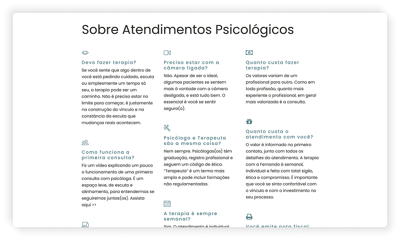
FAQ page with common questions
Can reduce emotional and practical barriers for those considering therapy.
Real photos and a visual identity that reinforces warmth and safety
Used by some competitors, but still underutilised, presents an opportunity to build trust visually.
COULD HAVE
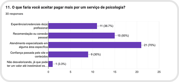
Client testimonials
This is a key trust-building element that reinforces the premium positioning Joseane aims to achieve.
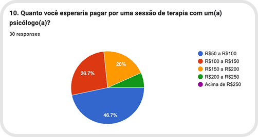
Transparent info about pricing or what the investment entails
Rare among competitors, but users expressed a desire for more clarity and transparency.
WON'T HAVE
Overly technical or academic tone
Identified as a barrier in user interviews, the tone must feel clear, human, and emotionally accessible.
A gap exists in emotional connection
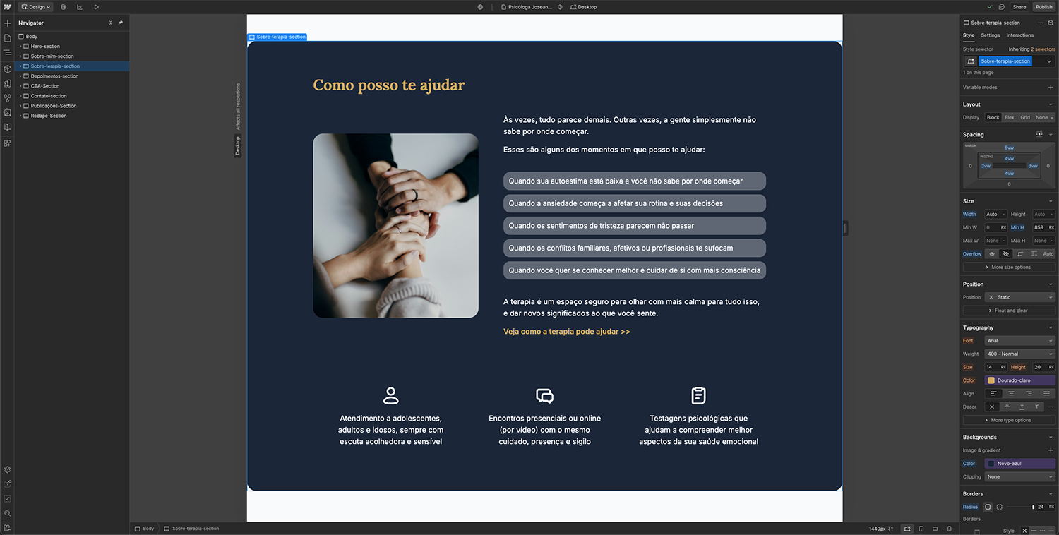
Most competitors either sound too abstract or struggle to create a sense of welcome, understanding, and safety for visitors. The “How I can help” section and the ”About therapy” page are key differentiators.
Communicating premium value without showing pricing
Emphasising key differentiators (evidence-based CBT, structured process, clear goals) respects CFP guidelines while reinforcing the service’s value proposition.
Humanized CTA
The phrase “Reach out when you feel ready” positions the service as premium while maintaining an empathetic, non-commercial tone.
Opportunity for Joseane to combine:
A professional yet welcoming tone
Clear, human-centered content
Transparent and user-guided navigation
And even empathy-driven messaging tailored to first-time clients
Trend

Content SEO - blog posts about anxiety/depression rank well
Continuous social proof
Direct CTA (WhatsApp)
Visible CFP/CRP credentials
Clean design + authentic photo
Evidence
Blogs by Rondon, Barranco, Carneiro
Testimonials in carousel or dedicated pages
Floating buttons on platforms and personal sites
Personal websites rely on professional portraits
Implication for Joseane
Maintain a blog, even occasionally, focused on specific keywords
Highlight testimonials on the homepage and About page
Implement a fixed, human-centered CTA
Display CRP number in the footer to build trust
Invest in a photo session to enhance authority and empathy

After defining the research insights, personas, user needs, and Joseane’s business goals, I moved into the ideation phase, where I began translating this understanding into meaningful structure and content direction for the website.
This stage was focused on finding the right balance between:

Creating a sense of emotional safety for users who might be feeling vulnerable,
Communicating Joseane’s professionalism and value without sounding impersonal or distant, and
Building a flow that guides visitors through the site gently and clearly, without overwhelming them with technical information.
Position Joseane as a competent and experienced therapist, capable of charging closer to the standard pricing.
Understand what therapy with her feels like, feel safe and welcomed, and know how to get in touch.
With that in mind, I started outlining content blocks and emotional flow for the homepage. Rather than beginning from a visual layout, I prioritised the narrative flow:
Start by creating connection and trust,
Then offer clarity about services and how the process works,
And finally guide the user to take action at their own pace.
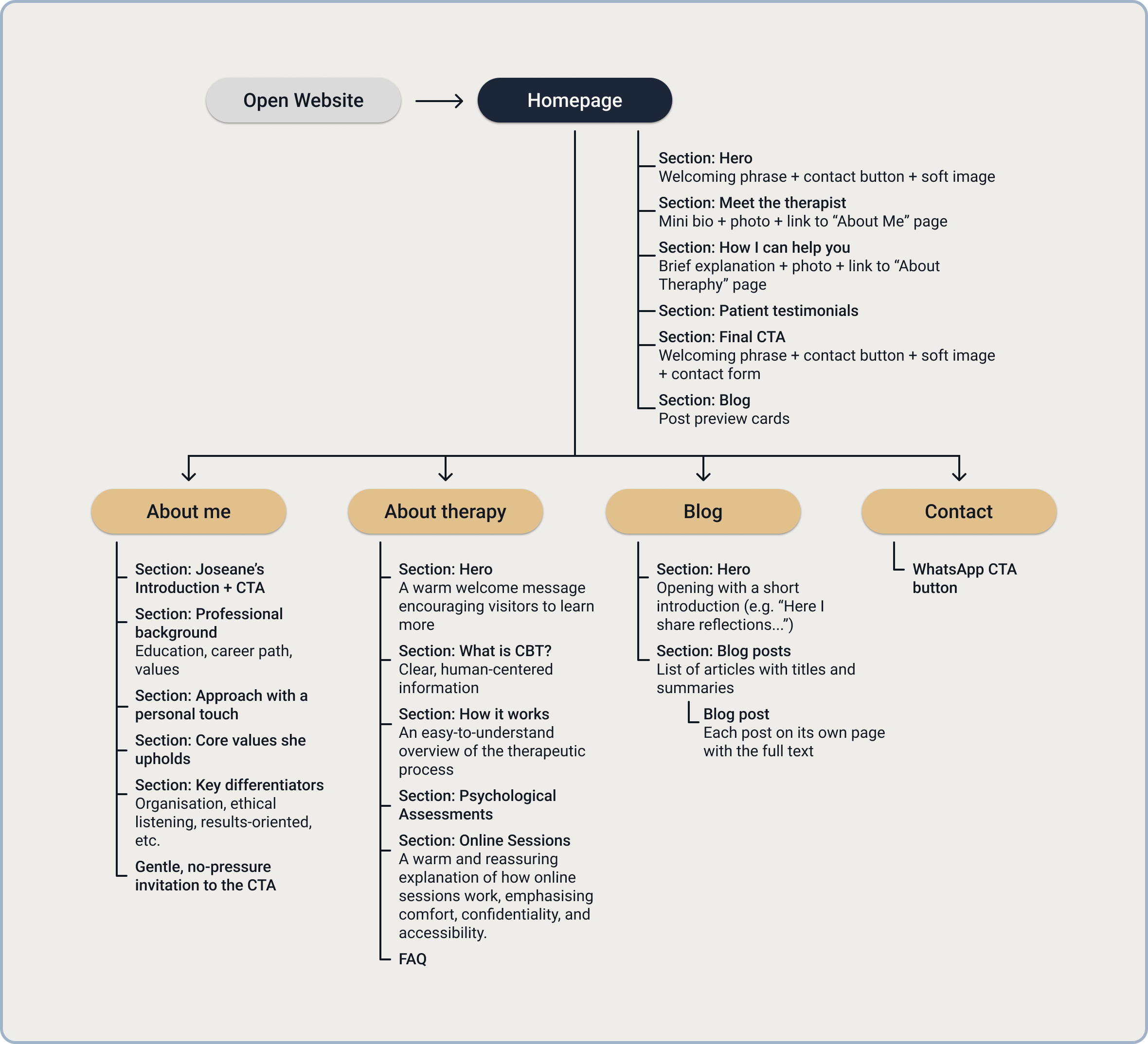
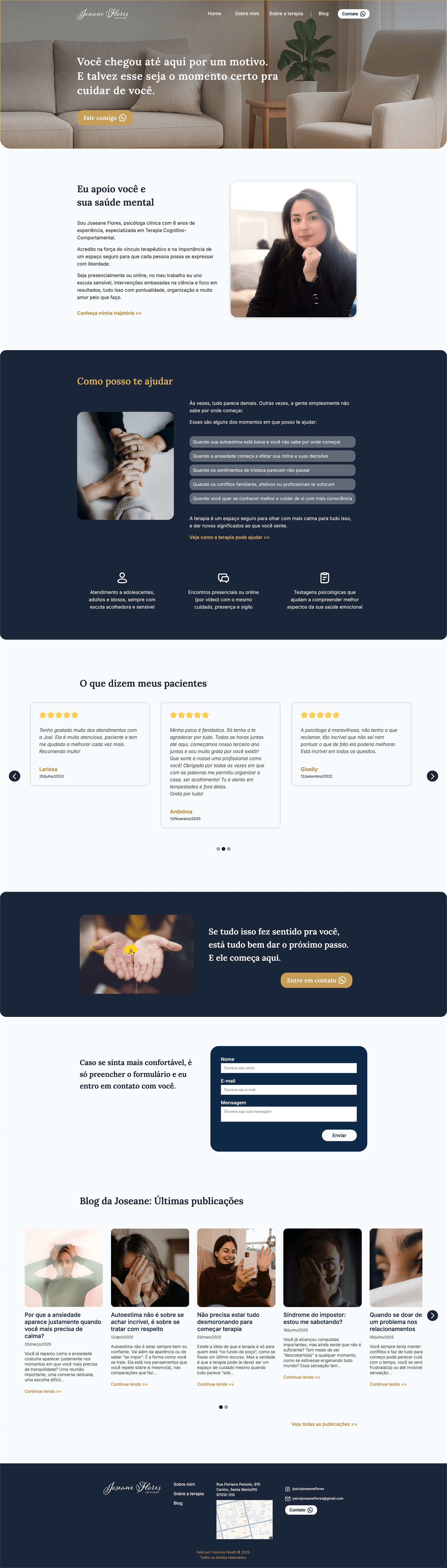
To ensure that visitors could quickly understand who Joseane is, how she can help, and how to get in touch - all while feeling emotionally supported - I designed a clear and intuitive site structure focused on emotional flow and scannability.
Instead of overwhelming users with pages and clinical terminology, the navigation was kept minimal, guiding the visitor through a narrative that builds trust step by step.
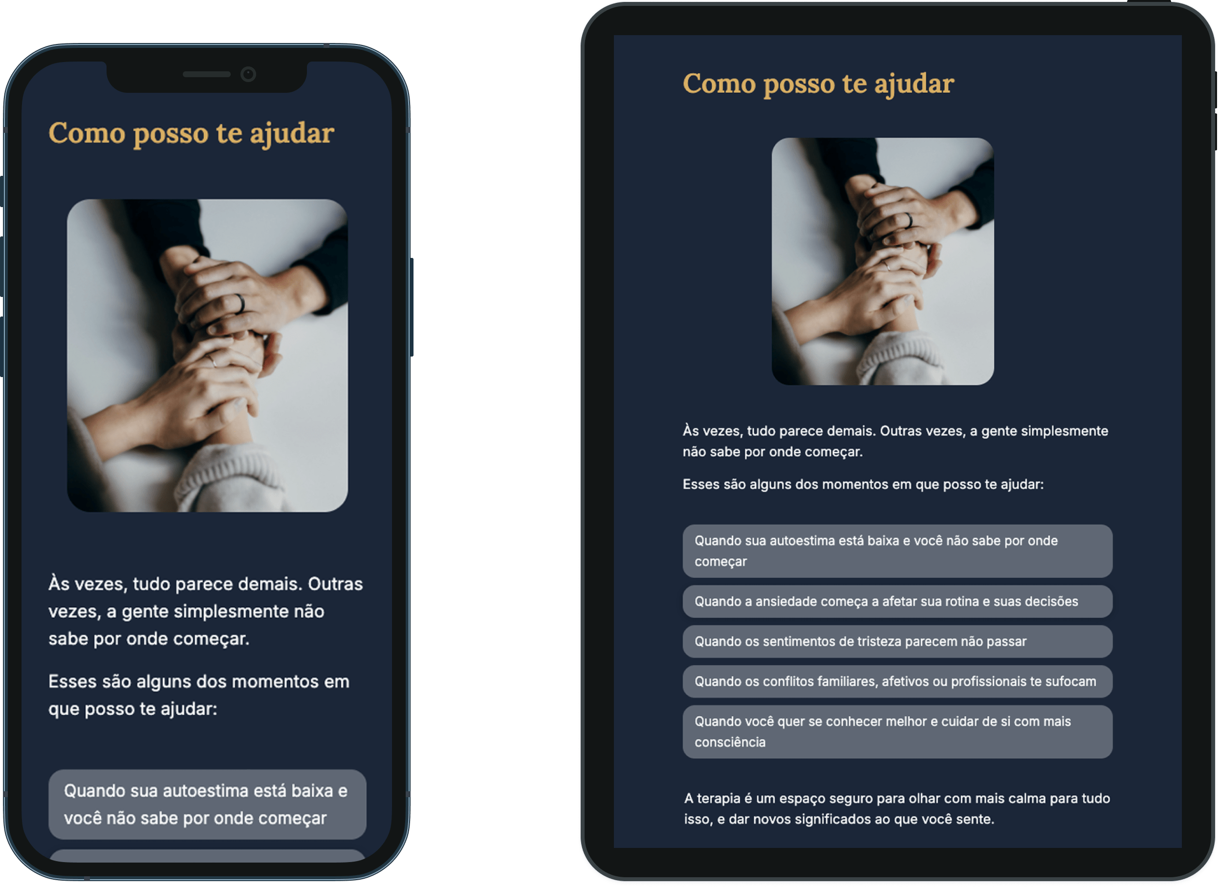
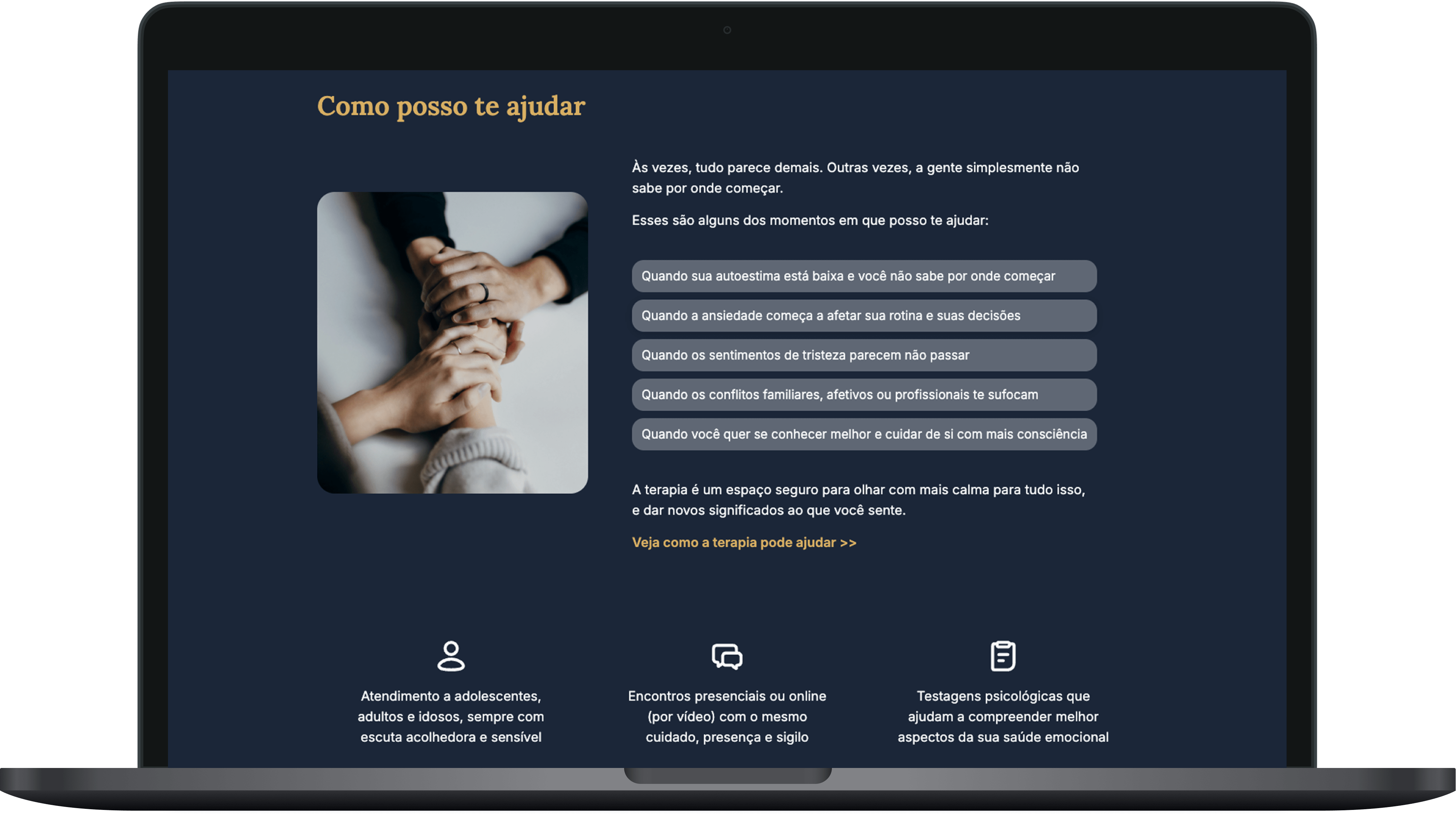
The site is organized into five main sections:
Home
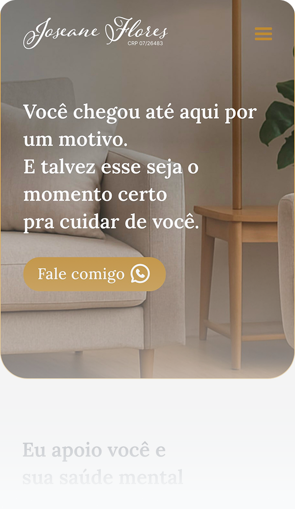
Welcomes users with a warm message, introduces Joseane, and highlights her services in a soft, accessible way, ending with an encouraging invitation to get in touch.
About me
Shares her professional journey, values, therapeutic principles, and who she works with. The focus is on building human connection, not just listing qualifications.
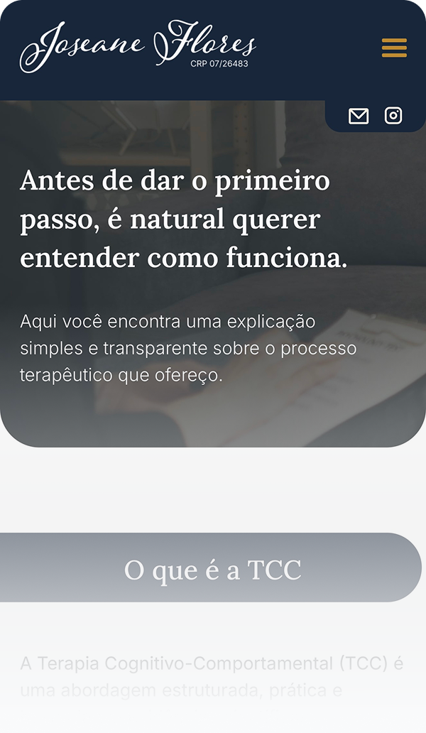
About theraphy
Explains how therapy works with Joseane, who it's for, the types of services offered (including psychological assessments), and what clients can expect from the process.
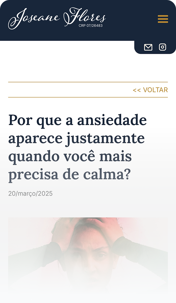
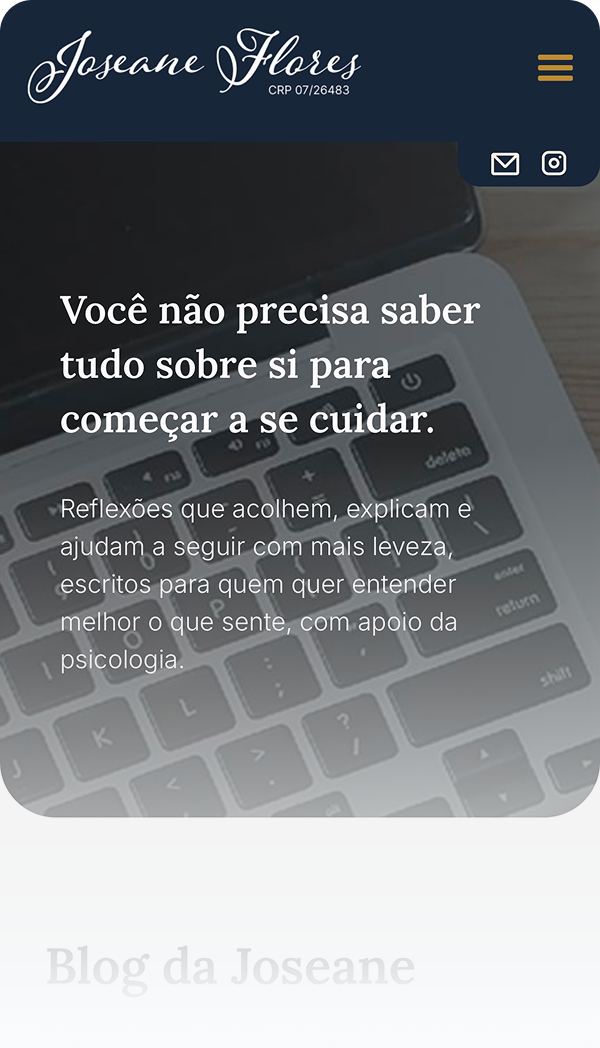
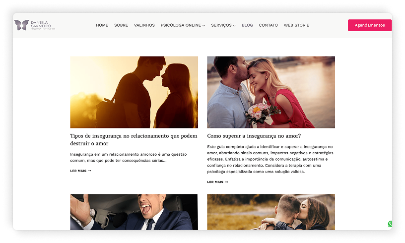
Blog
Provides helpful and reflective articles that reinforce her voice, build authority, and increase user trust through relatable mental health topics.
Contact
Offers a simple contact form and WhatsApp button, along with a friendly message encouraging the first step, while gently addressing common doubts or hesitation.

Mirrors the emotional journey of someone seeking help, from curiosity and trust-building to action.
Positions Joseane as a competent, emotionally intelligent professional, supporting her goal of attracting clients who value her work.
Each section is intentional, nothing is there just to fill space. Every page supports user confidence and clear decision-making.
Provides helpful and reflective articles that reinforce her voice, build authority, and The structure allows for blog expansion, FAQ additions, or testimonials if needed, without disrupting the flow. user trust through relatable mental health topics.

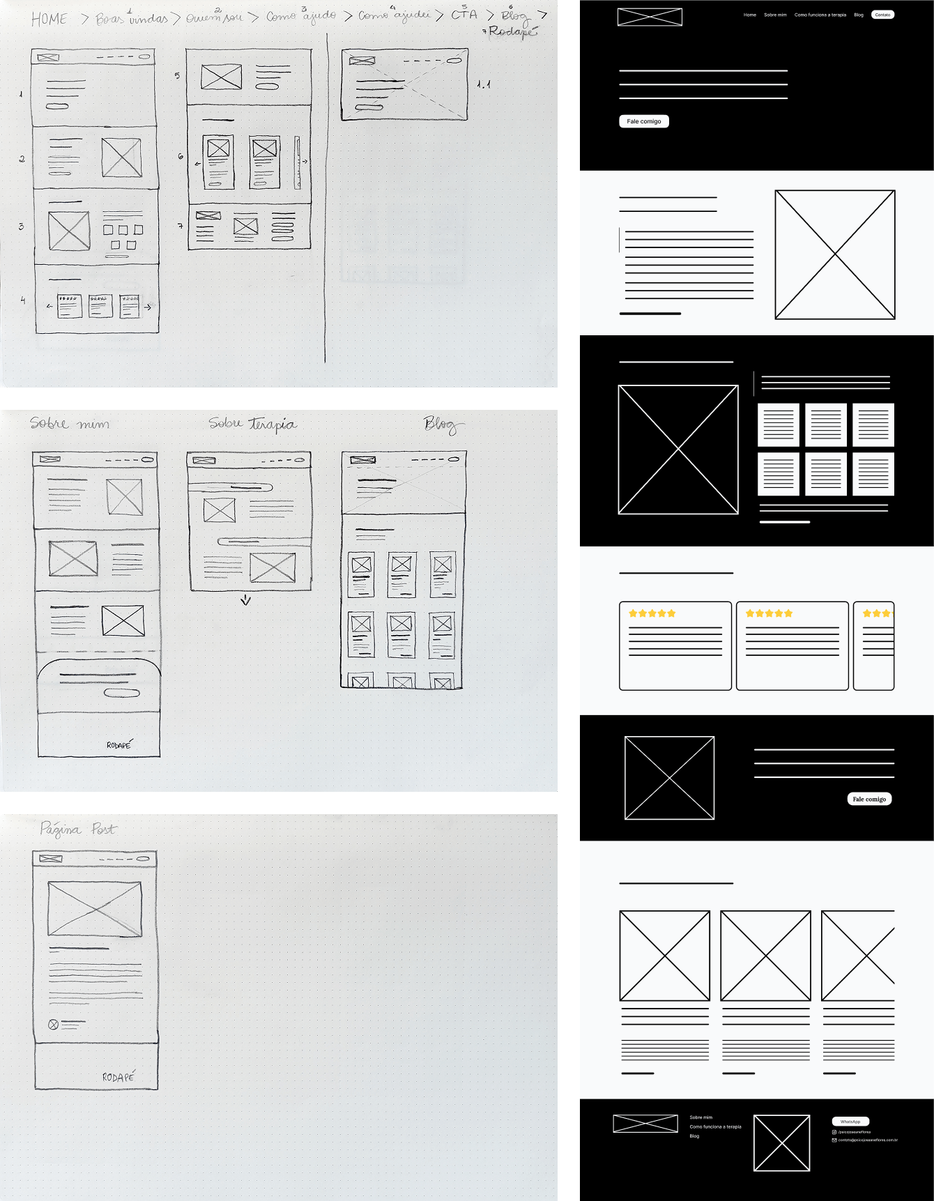
With the content structure and emotional flow defined, I designed low-fidelity wireframes and then evolved them into high-fidelity interactive prototypes. These allowed me to test layout logic, spacing, and key elements such as the emotional introduction on the homepage, the sequence of trust-building content (e.g., who Joseane is, how she works, who she helps), and CTAs placed in a way that felt supportive rather than intrusive.
The focus was on creating a site that feels light and easy to navigate without losing depth, especially important for users who may be emotionally tired, anxious, or hesitant about starting therapy.
These wireframes were used to organise the information hierarchy on each page, test section order and emotional pacing, especially on the homepage, and check visual breathing space before applying colours and images. I worked iteratively, refining the placement of service descriptions, therapist information, testimonials and emotional messaging, as well as contact and action points.
Although I didn’t conduct formal usability testing at this stage, I shared early versions of the wireframes with peers and asked for feedback from people similar to the user personas.
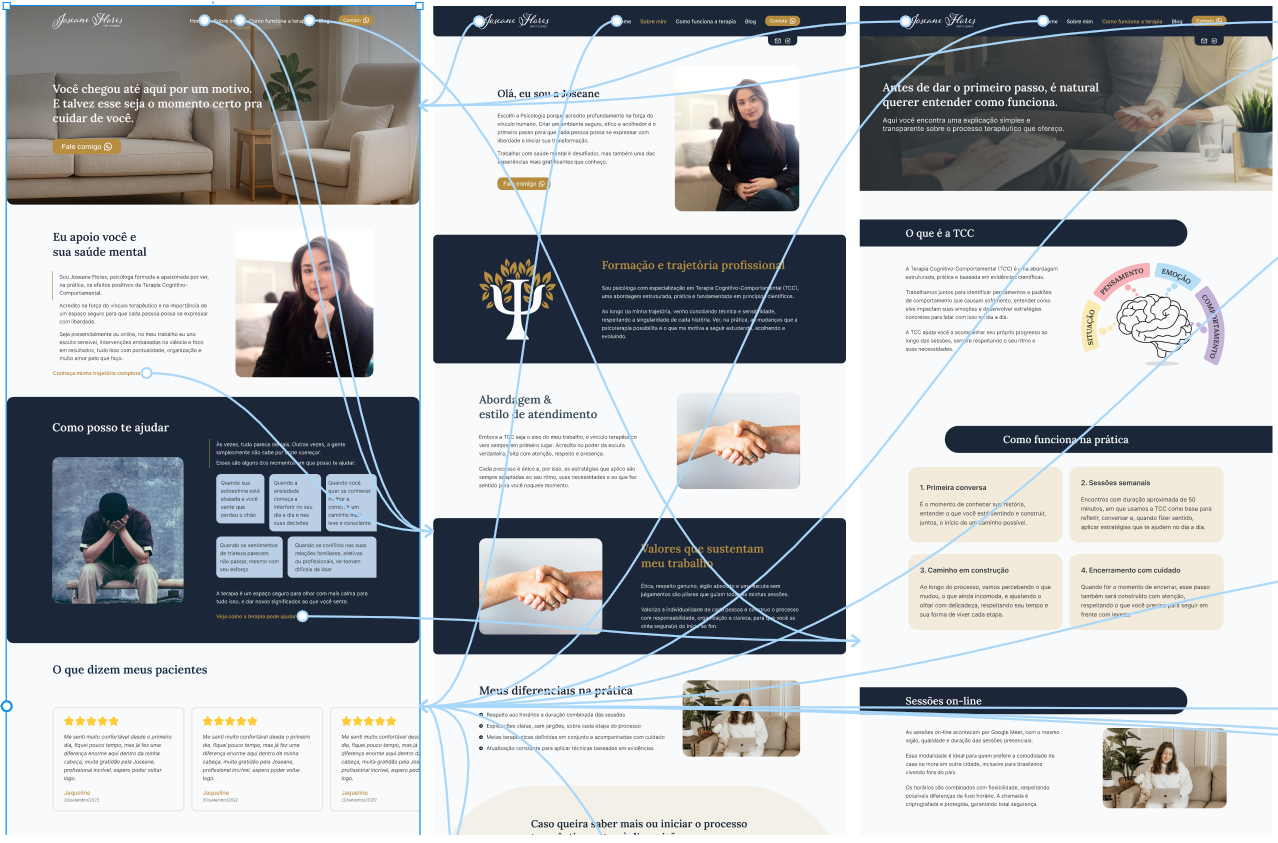
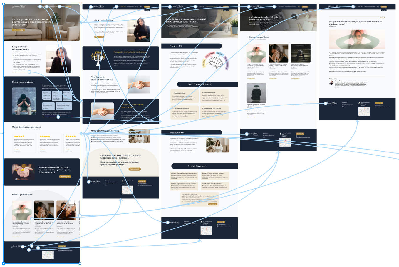
Once the structure was validated, I moved into the visual design phase in Figma, applying a colour palette that conveyed depth, calmness, and warmth, a clean minimal layout prioritising readability and emotional connection, and a warm, inclusive tone of voice throughout the copy.
Small interaction cues, such as hover states and generous spacing, were added to make the experience feel calm and deliberate.
I then built a navigable prototype to simulate the full user journey across devices and shared it for early feedback before development.

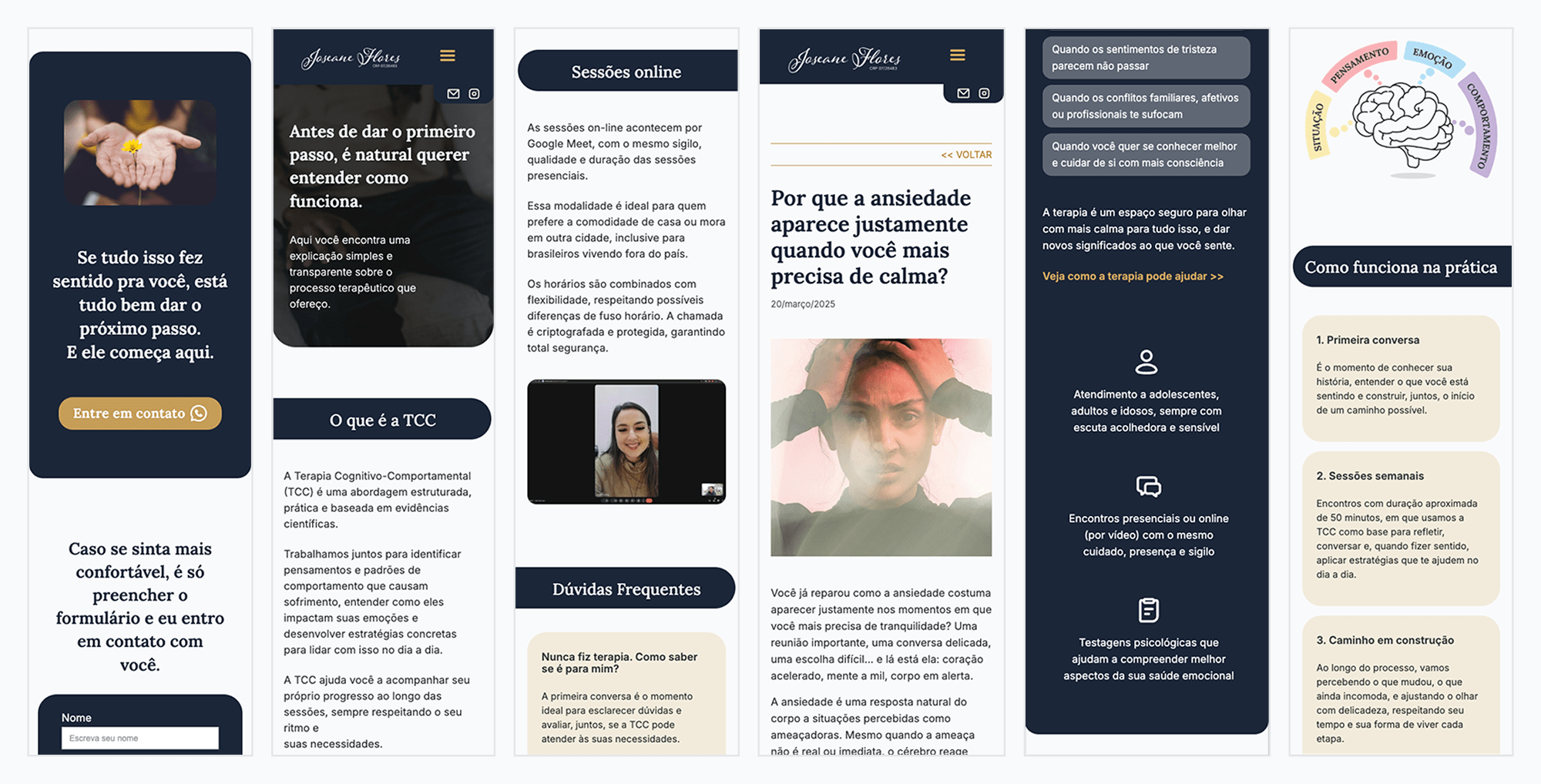
Each mobile page was crafted to maintain clarity, flow, and emotional tone, even on smaller screens.
Special attention was given to accessibility, ensuring readable font sizes, sufficient colour contrast, and clear navigation for all devices.
Adapting the layout ensured that key content remained accessible, clear, and trustworthy on any device.
With the high-fidelity prototype approved, I developed the website in Webflow, ensuring that every visual and content detail from the design phase was faithfully translated into a responsive and functional build.
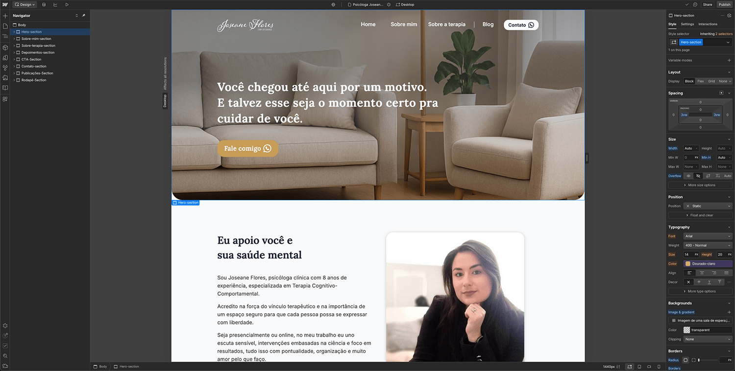
This is where it all came together, translating design into a real, responsive website using Webflow.
I optimised the layout for both desktop and mobile, preserving the calm and clear visual rhythm defined in the design stage. Contact features, such as the WhatsApp button and form, were implemented to be easy to find and use. The blog was structured with static pages (due to CMS plan limitations) but kept the appearance of a dynamic article list, maintaining consistency and visual harmony with the rest of the site.
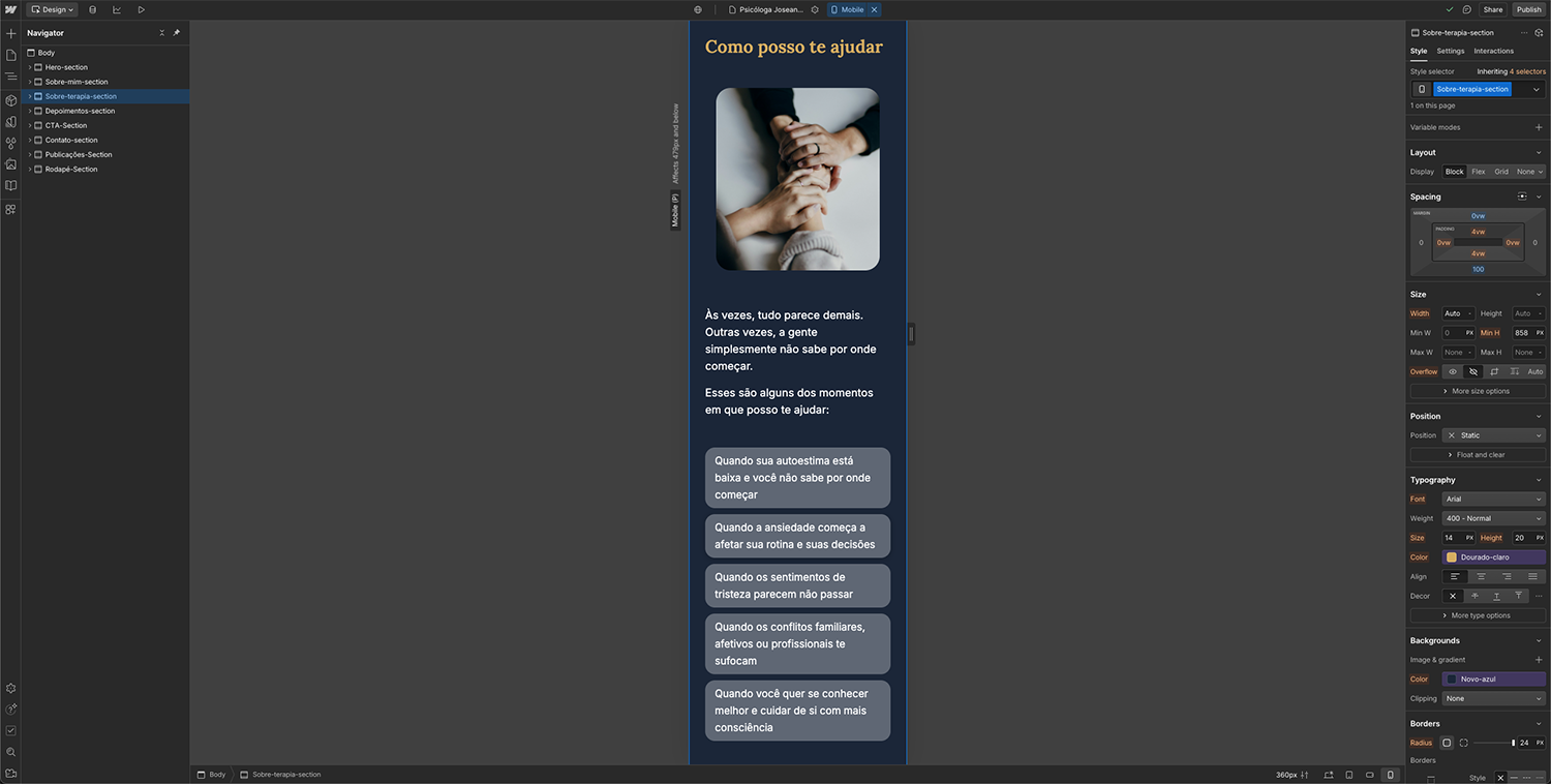
Development in Webflow allowed precise control over layout, responsiveness, and visual consistency.

Once the website was functional, I shared it with people similar to the target audience to gather early feedback. The goal was to validate whether visitors could quickly understand who Joseane is, how she works, and how to get in touch, while also feeling welcomed and supported.
Feedback confirmed that the tone felt warm and trustworthy, the structure was clear, and the navigation was easy on both desktop and mobile. A few small adjustments were made to refine spacing and improve CTA visibility, ensuring that users felt confident about taking the next step.


The final design delivers a calm, professional, and emotionally supportive experience that reflects both Joseane’s values and the needs of her clients. The colour palette and typography create a sense of trust and depth, while the clean layout ensures clarity and easy navigation.
Every section was designed to build connection before action, guiding visitors from first impression to contact in a way that feels natural and pressure-free. The responsive design ensures the same level of comfort and usability across devices, and the blog provides space for relevant content that strengthens her authority over time.
The result is a website that not only presents Joseane as a competent and approachable professional but also creates a digital environment where potential clients can feel safe, understood, and ready to start their therapeutic journey.


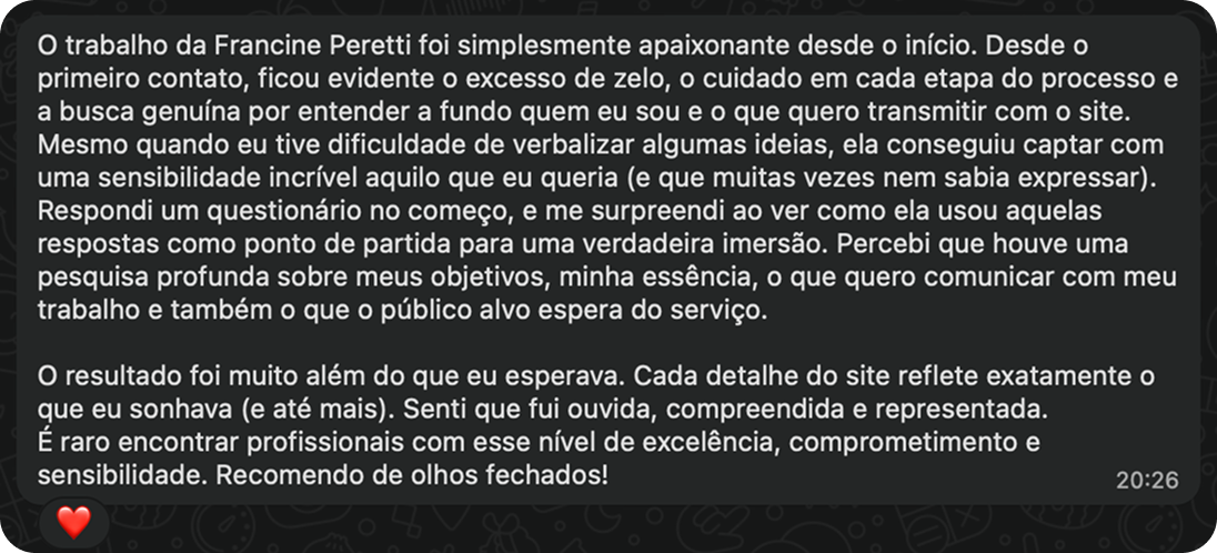

Francine Peretti’s work was simply captivating from the very beginning. From the first contact, it was evident how much care she put into every stage of the process and her genuine effort to deeply understand who I am and what I want to convey through the website.
Even when I had difficulty putting some ideas into words, she managed to capture with incredible sensitivity exactly what I wanted (and often didn’t even know how to express). We had an interview at the beginning, and I was surprised to see how she used those responses as a starting point for a true immersion. I noticed that there was thorough research into my goals, my essence, what I want to communicate with my work, and also what the target audience expects from the service.
The result went far beyond what I expected. Every detail of the site reflects exactly what I had dreamed of (and even more). I felt listened to, understood, and represented. It is rare to find professionals with this level of excellence, commitment, and sensitivity.”
- Joseane Flores

Every section was designed to build connection before action, guiding visitors from first impression to contact in a way that feels natural and pressure-free.
The responsive design ensures the same level of comfort and usability across devices, and the blog provides space for relevant content that strengthens her authority over time.
The site needed to feel safe and empathetic without losing clarity or overwhelming visitors with text. I then applied a clean, minimal design with generous spacing and clear headings, allowing emotional tone and practical navigation to work together.
Due to CMS plan limitations, we couldn’t build a dynamic blog structure in Webflow, so I designed the blog to look and feel like a dynamic list, even though it’s made of static pages. This kept the user experience consistent and allowed Joseane to publish articles without compromising the site’s design.
One of the biggest design challenges was finding the right balance between elegance and accessibility. I wanted the site to feel premium and trustworthy, but not so luxurious that it felt financially out of reach. The color palette went through several iterations before I landed on a combination that felt refined but grounded.
Another challenge was working with Webflow. While I had experience with the platform, several new features and changes had been introduced since I last used it. Rather than seeing this as a setback, I took it as an opportunity to learn, quickly adapting to the updates and using them to improve the final implementation.
I genuinely enjoy learning new tools and embracing unexpected challenges, which made this phase both productive and personally rewarding.
This project was an opportunity to combine user-centred design with a deep understanding of the emotional state of people seeking therapy.
The final solution met both the business goal of positioning Joseane as a higher-value professional and the user goal of feeling welcomed, safe, and understood.
Key takeaways from this project include:
Whether you’re looking to collaborate, hire, or just say hello, I’d love to hear from you.