MY
WORK


This project was a full website redesign that would reflect the quality and depth of Joseane’s work, not only to increase trust and connection with potential clients, but also to position her services at their true value.
The site needed to feel welcoming, calm, and human, and connect more deeply with potential clients while clearly communicating her expertise and unique approach to therapy.
I led the entire UX and UI process, from research and strategy to wireframes, visual design, and responsive prototyping. I’m also responsible for developing and publishing the final website.
Throughout the project, I worked closely with the client to align the design with her professional goals and ensure the tone, structure, and content reflected her expertise.

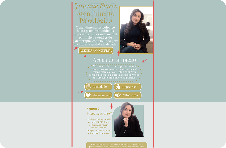
Joseane’s previous online presence didn’t reflect the depth or value of her work. It failed to effectively communicate her eight years of clinical experience and international practice.
The website lacked structure, visual hierarchy, and a cohesive identity, making it difficult for potential clients to understand her approach, trust her expertise, or feel emotionally connected.
Visually, it also didn’t convey the balance of professionalism and warmth that psychological care requires.

This solo project includes end-to-end design and front-end development for a fully responsive website. The scope covers research, content strategy, visual design, and implementation. With no external team and a flexible timeline, I had full autonomy to shape the user experience.
Although the primary goal is aligned with the psychologist’s business objectives, all design decisions are made with a user-centered approach in mind, and iterations are based on both client collaboration and user insights.
Reposition the therapist’s digital presence to reflect her clinical experience, professionalism, and the value of her services
Support a premium positioning by clearly communicating the quality of care and justifying future pricing adjustments
Provide a flexible platform to publish relevant content, such as articles and texts, reinforcing her authority and online presence
Build a clear, informative, and easy-to-navigate website that inspires trust, helps users quickly understand who the psychologist is and how she can help, and guides visitors through key content
Create a welcoming and emotionally supportive experience that helps potential clients feel safe and understood
Ensure the website is responsive, accessible, and easy to maintain over time


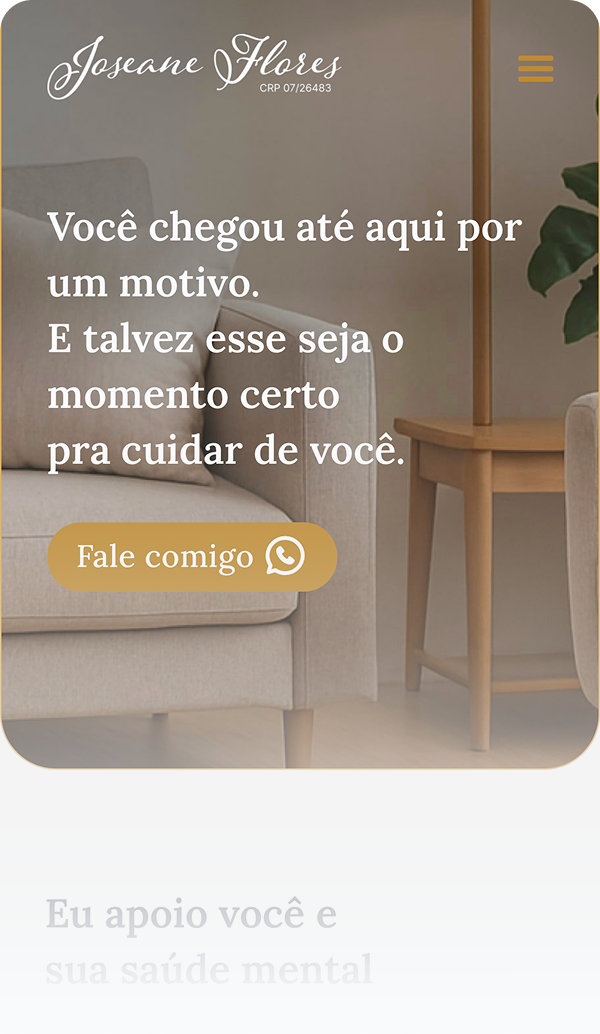
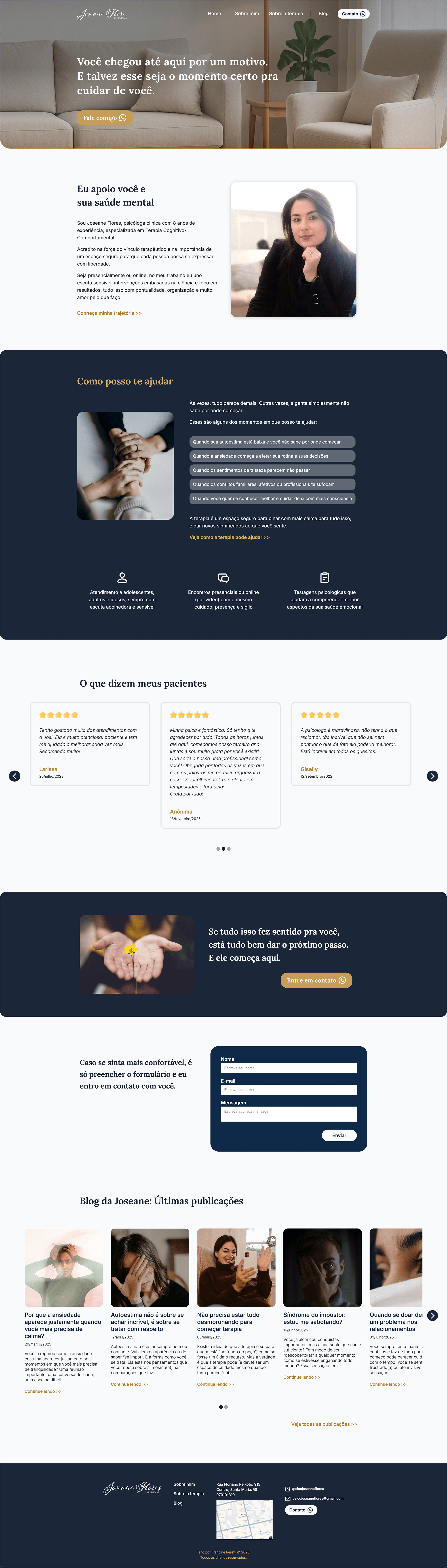
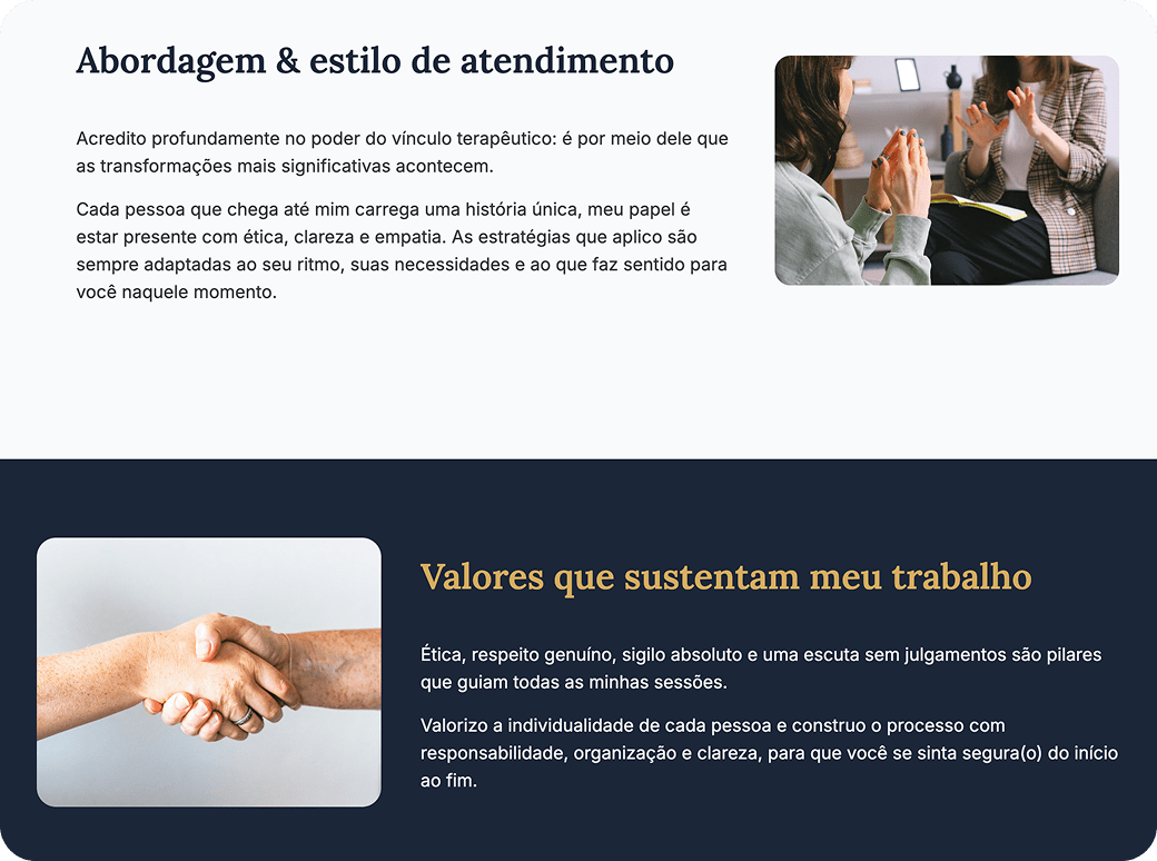
Warm, inclusive, and empathetic language to make visitors feel understood, while maintaining professionalism.

Prioritised clarity, readability, and visual breathing space to reduce cognitive load, especially for users feeling anxious or emotionally tired.
Interactive cues on buttons, links, and cards that provide instant visual feedback, making navigation feel responsive and deliberate while reinforcing the site’s polished and welcoming tone.

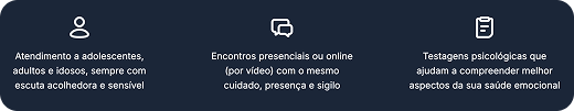
Integrated key information on services and psychological testing into a narrative format, using icons to make it easier to scan and keeping the tone human-centred.
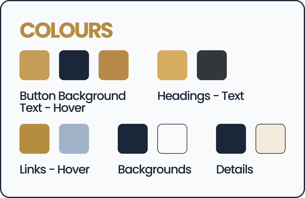
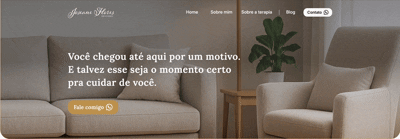
Refined yet approachable combination of deep navy and soft gold to convey calmness, trust, and sophistication without feeling inaccessible.
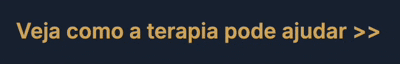
Structured to create an emotional connection first (who Joseane is, how she works, who she helps), followed by calls to action placed in supportive, non-intrusive ways.
Designed static pages styled to look like a dynamic list, maintaining a professional and consistent appearance despite technical limitations.
Section titles slide in smoothly as the user scrolls, helping guide attention, emphasise section transitions, and create a sense of progression without overwhelming the user.

Structured the homepage to build trust and explain her approach before cost became a consideration.
Integrated services into a narrative with icons and concise descriptions.
Designed static pages styled as a dynamic list for consistency and easy maintenance.
Refined the colour palette through iterations to feel premium yet approachable.
Learned and applied changes and new features quickly to enhance the final build.

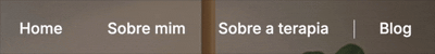
The navigation was intentionally kept minimal and spacious to create a sense of calm and ease from the very first interaction. It avoids overwhelming the user with too many options, instead guiding them gently through core sections like “About me”, “About therapy”, and “Blog”.
On hover, subtle animations provide clarity without distraction, reinforcing a trustworthy, professional feel. This simplicity is especially important in therapeutic contexts, where clarity and safety in the interface can mirror the values of the service itself.
The navigation features soft hover and slide interactions that guide the user’s attention without overwhelming them, reinforcing a sense of calm and control from the first moment.
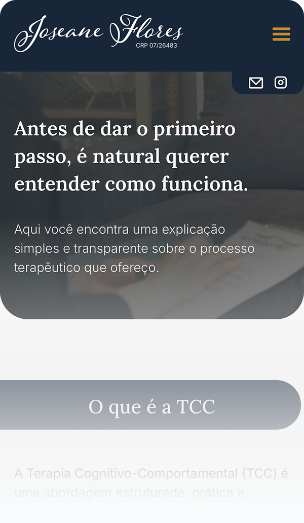
Knowing that many users would access the site via mobile, the layout was carefully adjusted for smaller screens, not just responsively, but intentionally.
Sections were stacked for intuitive scrolling, with generous white space to keep the experience light and digestible. Key CTAs like contact and blog links remain easily accessible. Images were resized to maintain emotional tone without clutter, and font sizes were adjusted to ensure legibility without zooming.
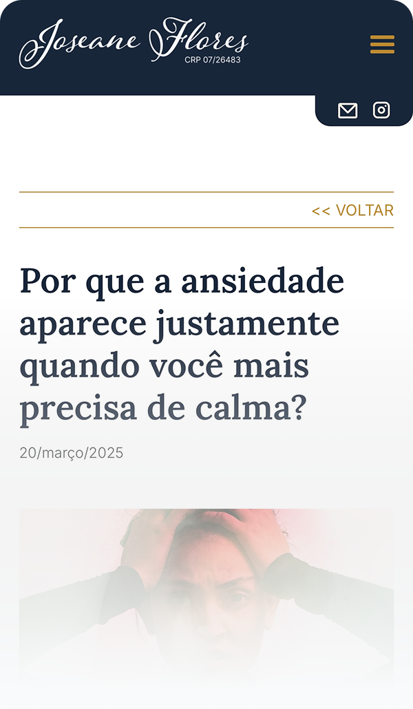
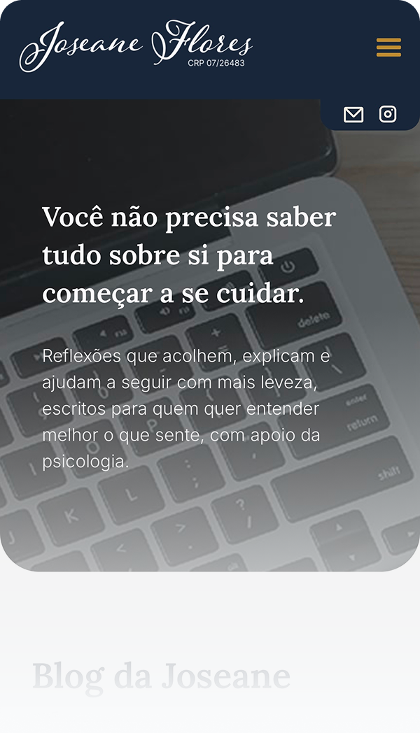
The blog was designed as more than a content hub, it’s a space where users can reflect, learn, and take small steps before committing to therapy. It also serves as an ongoing resource during the therapeutic process, offering support between sessions and reinforcing the psychologist’s expertise.
Each article preview includes a soft visual highlight, concise title, and short summary that encourages exploration without pressure. The blog plays a key role in building long-term trust, allowing users to engage at their own pace while deepening their connection with the therapist’s voice and values.
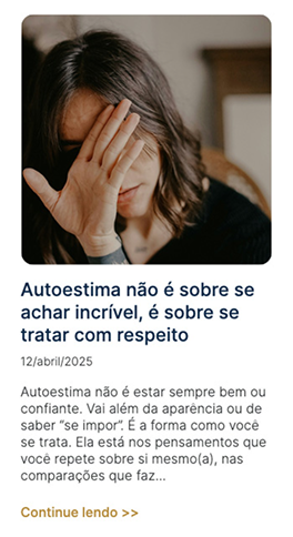
The blog layout encourages reflection and gentle exploration, supporting both new and ongoing therapy clients with curated, emotionally relevant content.
If you’d like to dive deeper into the full process, you can read the complete case study or visit the live website to see the final result in action.
Whether you’re looking to collaborate, hire, or just say hello, I’d love to hear from you.